My photos


I took this photo in greenwich but did not think that it was very abstract as it didn't brake any rules. I decided to layer parts of the photo over the original and change the colour of these parts to make it look different. I made the photos using photoshop and a app that allowed me to paint onto the images.
Abstraction...
Abstraction in photography can be understood as being 'wrong'. You draw the camera to a subject that might not be the key focus of what someone might usually think is correct - an example of this is focusing on a shadow and making that the main point to make the viewer look at that rather that what could have been the subject. Abstraction is interperated differently by different artists and this can been seen through out a range of different work. Many photographers that take abstract photos use the formal elements in their images however they dont follow the 'rules' of them as other styles of photography use.


The way that we took these photos was by making cardboard sculptures and cutting shapes out of it, then we made patterns out of other objects like coloured film and coloured paper- these ideas were inspired from watching a video made by anna lucas. We then arranged the sculptures in different places that capture the light to create shadows. I found this task fairly easy but i struggled to find different shadows and shape when taking the photos. For this task i was inspired by a video that we had watched in class.
I think that my photos came out ok however i know that for next time to capture different angles to get more shadows and reflections. I think that the second photo came out the best because you can see the light passing through the film and the shadows where the light has been blocked out by the card. I think that the photo that came out the worst was the ninth one because there is not very much or a shadow and i find it quite boring to look at.
I think that my photos came out ok however i know that for next time to capture different angles to get more shadows and reflections. I think that the second photo came out the best because you can see the light passing through the film and the shadows where the light has been blocked out by the card. I think that the photo that came out the worst was the ninth one because there is not very much or a shadow and i find it quite boring to look at.
second attempt...


|
These photos were taken with the same supture that i used for the last photo but we took our images outside with a background. I feel that this time the photos came out better because i was more aware of how to take the photos successfully. This task was inspired by the same video we watched in class.
I think this photo worked the best because it has broken the rule of focus. What would have been the main subject of the photo has been broken by the mask of the sculpture. |
|
no focus/out of focus - Bill Armstrong...


The areas in this photo don't appear to be clear of sharp because of the out off focus affect that the photographer has chosen to use. The areas where there are colour are the brightest and where most of the light is an you can see a slight shadow in some of the images above. I think that the photographer has used a range of natural and artificial light in the mix of images because is looks much softer in some of the photos compares to the others. Most of the lines in the photos are curvy and are outlines rather than solid lines. There is no constant theme that is repeated other than having no focus. The shapes in the images are organic because their are no straight lines. I think that the photographer uses the negative space in his photos as an advantage because it allows you to focus on the shapes that are amongst the blur. The darkest values are usually around where the people are and the lightest where the colour is.
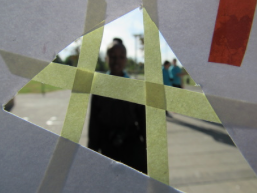
obscured and disrupted views - Akihiko Miyoshi...


|
The coloured dots on the images are what appear the clearest or sharpest. The brightest areas of the photo are the dots, this might be so that your attention is drawn to them. I think that the light that they used was reflected as it isn't very harsh, it was also placed in front of where they are and this created a shadow on the wall. Their is a mix of both curvy and straight line in the photo that act as outlines to the objects. One object in the photo that is repeated is the colourful dots in the image. There are is a mix of both geometric and organic shapes however most of them are organic. The spaces in the photos are mostly filled but the spaces that have been left are affective because it make the rest of the image stand out. The dark tones are all in the background and the light in the foreground this makes the colours stand out.
|
Homework...
|
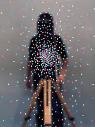
The clearest parts of the photo are the stationary objects, like the road and the road signs. The whole photo is very bright, I think that this is because the light is used to take the image was natural and is therefore quite soft. I am unsure of if their is a shadow produced from the car because the photo is out of focus from the movement. There are lines that are on the road and lines created from the high-speed movements, these lines show both energy and movement of high speeds. Their is a pattern of white rectangles on the road and all these shapes are also geometric as are the other shapes in the photo capturing the two cars. The photo is very busy and is there is mainly positive space in the middle and negative around these areas. The darkest values are around the car and the lightest are on the cars as reflections.
|
|


In this task took sixteen images using only one piece of paper I also used the studio lights. I started to find it difficult after taking about 5 photos as I didn't know what to take photos of. I didn't take many risks in this task other than scrunching the paper up so early, this limited the amount of photos i could take. My images are very straight edged as an effect of the light, the light created shadows which defined the line in the images. The thing i enjoyed most was creating shadows with the artificial lights. This photo has not given me ideas to start my own series of photo like this as i feel as the amount of photos you can take is limited.
Homework...


My home work was to take 16 close up images. I found this task easy once i had figured out how i wanted my photo turn out. I think that the photo of the straws worked the best because it was three of the formal elements - these being shadow, colour, focus.
Classwork...


In this lesson i took 16 images using the paper masks i made a few lessons ago and take abstract photo. These images were the most thought out from all the images i have taken using the paper sculpture.


Saul Leiter evaluation...
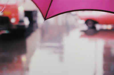
I chose this photo because it uses a lot of the formal elements. One things that is unusual about is the depth of field. I found it unusual because the subject that the photographer chose to focus on was the boldest part of the picture and makes me think about what it would look like if it was a different subject. One formal element that i think is important in the photo is lines. I think this because the thick outlines around the block colour makes it the first think you see when you look at the photograph. Saul leiters images are abstract because of his use of the formal elements such as focus and colour. We can see this in the in the bold colour of the umbrella and the out of focus red in the background. I also think that the angle of the photo is important, the photo is very straight and might suggest that it is from the perspective of the photographer.
Abstraction...


Hannah Hoch...


Hannah Hoch, born 1889 - died 1978 . She was and artist that layered cutouts of popular magazines and images to create a whole new image. She focused alot of her work in the 1920s on gender issuses. Her work is very unusual and the work she produces always loos different to the last piece.
John Baldessari...


John Baldessari , born 1931 lives and works in santa monica, venice and california . He started his work as a painter , however in 1970 he began add photography in to his artwork. He uses prime and bold colours to put over peoples faces as he believes that with out this the images are to boring. He looks for the photos that he use in his work in bins, one reason for this might be because they are not very bold and they dont have anything about them that stands out.
Final Project Idea...
I have decided to take photos using John Baldessari as inspiration. He uses coluored circles to cover peoples faces. I want to create images which look similar to this by covering the faces of people with other shapes such as crosses. I would also reverse the way which he displays this by I having Coloured images with white crosses over the faces of people. I'm hoping to achieve this by taking photos and then using Photoshop to cover the faces. I would present my photos on a white piece of card.
These are the photos I'm going to edit:
These are the photos I'm going to edit:


FINAL PROJECT...


So far i have taken 6 photos and have edited them with the cross. However i have changed the idea of having coloured photos and white crosses to having black and white images with blue crosses as i think that the contrast between the black and white and bold primary colour with make the photo look better.
During this project i have researched the work of John Baldessari, I recovered his work when we studied some of it in lesson. I have learned from studying his work that abstraction can be very different in the way that it is portrayed. At first i thought that this was going to be a bit difficult to do but once i understood how I wanted it it was quite easy. my ideas about presentation changed because i decided to put the original image under the first photo. I think that the contrast between the black and white and blue bold colours worked well in the photo opposed to colour images with white crosses over them because ei don't hunk that that would have stood out very well. To help me with my work i used photoshop to edit the crosses over the photos. one thing that i think worked well was the layers of photos. i think that i succeeded in the final idea of what i wanted to do.
During this project i have researched the work of John Baldessari, I recovered his work when we studied some of it in lesson. I have learned from studying his work that abstraction can be very different in the way that it is portrayed. At first i thought that this was going to be a bit difficult to do but once i understood how I wanted it it was quite easy. my ideas about presentation changed because i decided to put the original image under the first photo. I think that the contrast between the black and white and blue bold colours worked well in the photo opposed to colour images with white crosses over them because ei don't hunk that that would have stood out very well. To help me with my work i used photoshop to edit the crosses over the photos. one thing that i think worked well was the layers of photos. i think that i succeeded in the final idea of what i wanted to do.
The wandering bears...
Wandering Bears is a photography workshop. The photos that we were recreating are at the top and our attempts at recreating are underneath.


