edges introduction
Edges, first 30 images...


The best six...
|
|
Out of the thirty photos that i took i think that these were the most successful. I think that the criteria needed to take a 'good' edges photo has been appiled to the six. If i was to retake these images i would take more time to think about the composition and colours. I would like to add a bold colour to the photos with either photoshop or finding a location with what i wanted as i think that the photos are quite dull and plain at the moment.
|


|
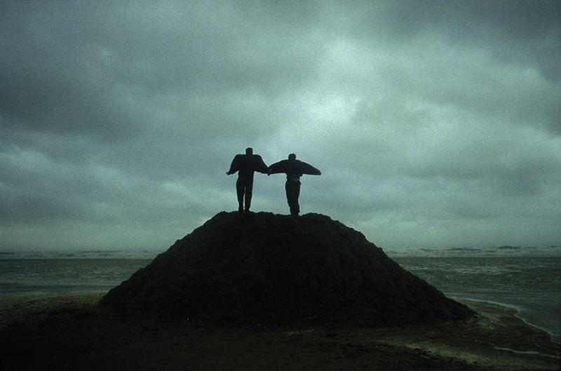
This is the photo that I like best out of the six I have chosen. I like this image because of the composition, your drawn to the centre of the image and it is fairly symmetrical on both sides. The way that the light has been use in this photo is good because it means that you can't see much of the detail of the people, this allows you to question who they are and why they are there. I would like to see how the photo would look if it wasn't cloudy to see the contrast between the sun and the clouds, I also think that this would change the mood to the photograph as it would be bright and light rather then dark and dull.
|
Edges, second attempt...


I think that these photos came out much better then the previous images, this is because the edges are much cleared and better composed. in the majority of the photos there is a common theme of the colour blue and architecture of the school building. If i were to take the photos again i would like to make the main focus of all the images be in the middle of the frame, this is because it would make the series of photos work better and complement the others.


Lucio Fontana...


|
The thing that I like about lucio fontanas work is that it is very minimalistic. The composition is very simple yet effective, usually the main focus of the photographs are in the middle of the frame. He uses bright bold colours in his photos and i think that the cut through the paper works very well to break up the image and instantly draws your eye towards it. If i was to recreate these photos i would have something showing behind the cuts in the paper to have a different view on the way that fontana took his images.
|
* Use of bold colours
* simple * sharp edges * shadow behind the paper |
My attempt one...


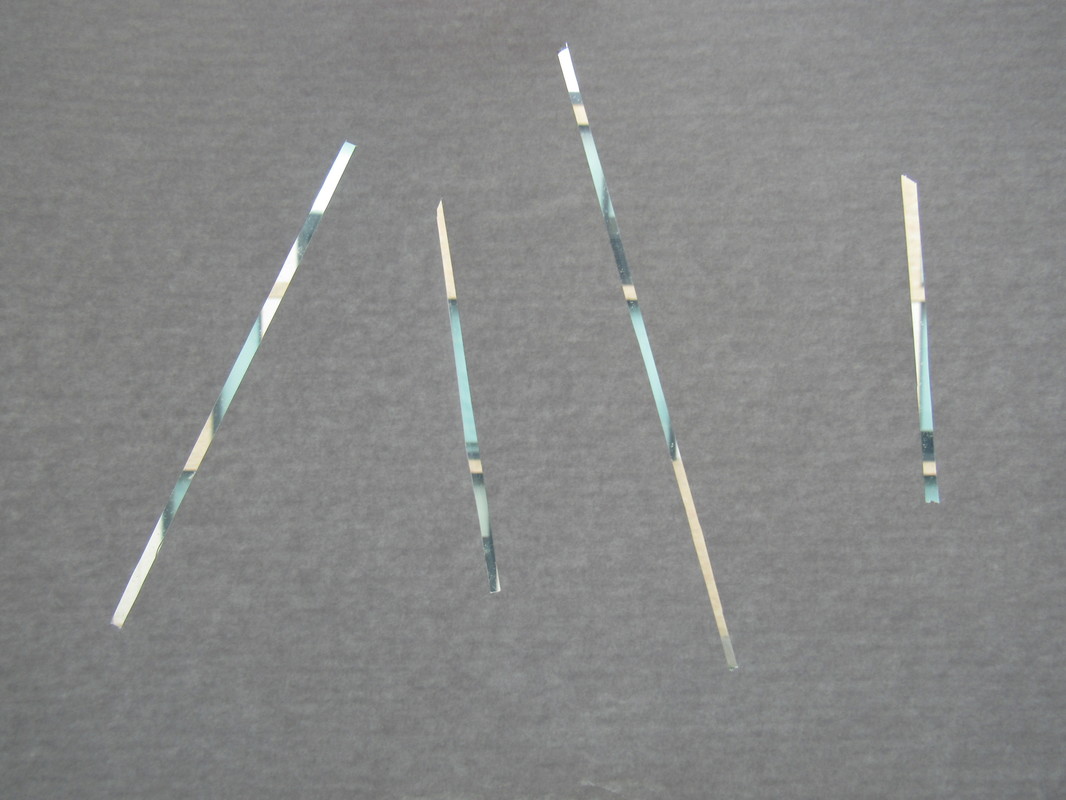


I don't think that these photographs came out very well because the paper was to light and therefore the images look messy because you could see through the paper because of the light behind. I also think that if i had cut the gaps in the paper thicker the pictures would have come out better as you would have been able to see some of the objects or photographs behind them. Next time to improve i will cut the spaces bigger and use thicker and maybe colourful card so that you can't see behind more than what the gaps are showing.


I feel like this time my work is more successful as i have begun to achieve what i was trying to create in the first round of images. I have used a coloured card and cut the slits thicker so you can see more of the background. The composition of the photographs is more central and randomly arranged.


FINAL PIECE LESSON PLAN...
For my two hour lesson plan i am going to use a deck of cards and alter them in different ways. I want to do this for the majority of the lesson as it will give me a chance to make my images more thought out and come out the way i planned for them to do so. For the rest of the lesson i will evaluate and think of improvements for my images, and if possible put the improvements on to my work in the same lesson. The last thing i will do is present my work.
MY FINAL PIECE...


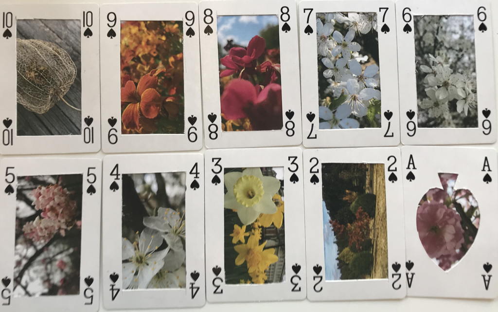
For my final piece i didn't research a specific artist, however i did spend a lot of time thinking about how i wanted to portray the images. i wanted to express the theme of edges in my work i did this by using lines in my photographs. In my experiment i have cut out the centre of cards and placed photos behind them. I made the deception to use coloured photos rather than black and white to make them stand out more. One thing that worked well was the elements of the cards i placed on top of the photographs. I found cutting the cards to the right size the most difficult as i had to make them look as equal as i could. My final outcome for this project overall was not as successful as i thought it would be, my idea came out the way i wanted it to however it does not look as good as i imagined it to. If i had more time i would use different photos that might fit the theme in a better way, i would also use a whole deck of cards to make a full pack of cards. I hope that when people look at my work they can understand the approach i took on the theme of edges.
